I'm a web developer and I do my best to create accessible interfaces and teach others to do so. I don't have dyslexia myself but have a very close family member that does. In tackling web accessibility unfortunately dyslexia isn't talked about as much as other conditions, and I think it's largely because it's harder for non-dyslexic folks to actually understand. Blindness, okay I can close my eyes and have a rudimentary sense of what types of things are more difficult. Hearing loss or deafness, I can plug my ears or mute my computer to have a crude understanding of what becomes more difficult. To be clear I'm not saying that you can have a full sense of what it's like to have these conditions - that's not the case at all. What I'm saying is dyslexia has historically been harder to "simulate" and as a result harder for folks to understand. Add to that it seems not everyone experiences dyslexia in exactly the same way so any simulation will be imperfect. It's really hard to make an experience better for someone if you don't understand how they experience the world.
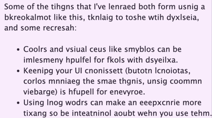
I've perpetually had a bookmarklet installed since I discovered it which simulates dyslexia just like the image above. It's a powerful reminder and I think developers and designers should actively use tools like that. Eventually you'll just remember what makes for a good or bad experience and not need the bookmarklet.

Some of the things that I've learned both from using a bookmarklet like this, talking to those with dyslexia, and some research:
- Colors and visual cues like symbols can be immensely helpful for folks with dyslexia.
- Keeping your UI consistent (button locations, colors meaning the same things, using common verbiage) is helpful for everyone.
- Using long words can make an experience more taxing so be intentional about when you use them.
- Don't create timed access to articles (like a news site giving you x minutes to read the content before it goes away.) reading the article under a time limit is stressful for everyone, doing it with dyslexia even more so and when you speed read like that often it wont fully sink in.
- Making your articles able to be listened to can be an enjoyable alternate way to consume your content. HubSpot actually has this built-in now.
- Sans serif fonts can help. Dyslexia fonts exist though based on talking to folks who have dyslexia they've felt very skeptical that they work.
- Text should be 16 to around 19px in size though that may vary by font used and person.
- Larger line-height can make text more easy to read.
- Breaking up text with images that add context, relate concepts etc can make content more digestable and less taxing.
Much of this guidance you're hopefully also thinking to yourself "I would appreciate this even if I don't have dyslexia". That's because these are generally just good practices to follow for everyone anyways. Everyone can benefit when you design and build for accessibility.